After a decade in webdesign, I’ve seen some sites thrive and many struggle. Often, small mistakes create big problems, harming both user experience and search rankings. A good-looking site means nothing if its structure and function are weak.
Your website represents your brand at all times. When someone visits, you have seconds to impress before they leave. This article covers lasting issues in site structure and UX that reduce trust, harm conversions, and cause major design penalties.
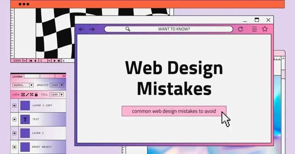
Let’s dive into the seven most critical common web design mistakes to avoid—and, more importantly, how to fix them today.
1. Ignoring the Mobile-First Imperative: The Responsive Design Flop
For years, we’ve talked about “responsive design,” but today, it’s a “mobile-first” world. Search engines use the mobile version of your site for indexing and ranking. If your mobile experience is an afterthought—a desktop site simply squashed onto a small screen—you are actively sabotaging your search engine visibility and frustrating the majority of your audience.
The mistake here is designing for a large screen first, and then trying to ‘cram’ the elements into a small screen. Consequently, this often leads to tiny, unclickable buttons, huge images that dominate the viewport, and excessive scrolling. The ultimate consequence is a serious non-responsive web design penalty from Google.
Expert Fixes:
- Audit Your Breakpoints: Don’t just check your site on a phone; test on mid-sized tablets and various mobile resolutions. Look for horizontal scrolling, which is a major UX failure.
- Prioritize Content: On mobile, only display the absolute most essential content and CTAs “above the fold.” Meanwhile, everything else should be easily accessible but not obstructive.
- Touch Targets: Ensure all buttons and links are large enough to be easily tapped with a finger (aim for a minimum of 48×48 pixels).
2. The Slow-Load Time Killer: Unoptimized Media and Bloat
Moving on from responsiveness, speed is a non-negotiable feature. If your site takes longer than three seconds to load, you are losing nearly half of your potential visitors. Users have zero patience for the loading spinner. This is one of the most common yet easily rectifiable web design mistakes to avoid. It’s usually the result of excessive plugins, inefficient hosting, or, most often, enormous, unoptimized images.
You need a proactive website to fix the slow load time. Crucially, this impacts your Google Core Web Vitals score, which is a key ranking signal.
Expert Fixes:
- Compress Everything: Use modern formats like WebP for images. Never upload a 5MB photo; compress it down to under 100KB using tools like TinyPNG. Implement lazy loading so images only load as the user scrolls to them.
- Minify and Consolidate Code: Reduce the size of your CSS and JavaScript files by removing unnecessary characters (minification). Furthermore, where possible, consolidate multiple small files into fewer, larger ones to reduce the number of HTTP requests.
- Leverage Browser Caching: Ensure your server is telling returning users’ browsers to store static files (logos, core CSS) so that the site loads instantly on subsequent visits.
3. Ambiguous and Missing Call-to-Action (CTA)
Beyond speed and responsiveness, every page on your website needs a purpose. If a visitor reaches the end of an informative blog post or scrolls past a compelling product feature, and there is no clear direction on what to do next, you’ve committed one of the worst unclear call-to-action errors. A missing or vague CTA is a lost conversion, plain and simple.
Vague terms like “Click Here” or “Submit” don’t convey value. Instead, your audience should know exactly what benefit they receive by clicking the button.
Expert Fixes:
- Clarity is King: Replace vague phrases with action-oriented text that addresses the user’s intent.
- Bad: “Submit” / Good: “Download Your Free Ebook”
- Bad: “Contact Us” / Good: “Schedule a 15-Minute Consultation.”
- Visual Dominance: Your main CTA must be visually prominent. Use high-contrast colors that stand out against the background, and ensure there is enough surrounding white space to draw the eye.
- Strategic Placement: Don’t limit your CTA to the very bottom. Place secondary, less disruptive CTAs contextually within the body content and a clear, primary CTA at the top and bottom of your key landing pages.
4. Poor Typography and Readability
Unlike load times, which are immediately obvious, this is a subtle but pervasive common web design mistake to avoid. If users have to squint, struggle with low contrast, or feel overwhelmed by long blocks of text, they will leave. Typography isn’t just about choosing a pretty font; rather, it’s about optimizing the reading experience.
Failing to improve website typography readability creates unnecessary cognitive load for your visitors.
Expert Fixes:
- Font Sizing: A cardinal rule: body text should be no smaller than 16px (and often 18px is better, especially on mobile). Headings need to establish a clear, descending hierarchy (H1, H2, H3).
- Contrast Matters: Ensure a high-contrast ratio between your text and background. Light gray text on a white background is a common visibility killer.
- Line Length and Spacing: Long lines of text are difficult to track. Aim for 50-75 characters per line on desktop. Then, break up paragraphs into short, digestible chunks (2-4 sentences max), and use bulleted lists like this one!
5. Overlooking Digital Accessibility (WCAG Compliance)
Furthermore, designing only for non-disabled users is not just an ethical oversight—it’s a critical legal and business risk. Failing to adhere to basic WCAG (Web Content Accessibility Guidelines) means excluding 20-25% of the population. In addition, many accessibility standards (like proper heading tags and Alt Text) are directly tied to SEO ranking factors. If you’re ignoring the need for a basic accessibility errors website checklist, you are leaving a major market segment behind.
Expert Fixes:
- Image Alt Text: Every non-decorative image needs descriptive Alt Text. This is vital for screen readers and for image SEO.
- Keyboard Navigation: Your entire site should be navigable using only the keyboard (Tab, Enter, Spacebar). Specifically, this is the key test for users who cannot use a mouse.
- Sufficient Color Contrast: Use a color contrast checker to ensure that all text meets the minimum required contrast ratio (typically 4.5:1).
6. Cluttered, Confusing, and Overloaded Navigation
Another common problem area is the user journey. A website’s navigation is its blueprint. When a user lands on your site, they should instantly understand how to find your core services, your pricing, and your contact page. The mistake is often cluttered site navigation—too many main menu items, vague labels, or buried information. Confusing navigation forces users to think and search, which invariably leads to immediate frustration and a high bounce rate.
Expert Fixes:
- Simplify the Main Menu: Limit your primary navigation to 5 to 7 essential items (e.g., Home, Services, Pricing, About Us, Contact).
- Use Descriptive Labels: Avoid using cute or overly creative names for menu items. Use terms your audience expects: “Services,” not “Our Magic.”
- Clear Hierarchy: Use clear drop-down menus (sparingly) and a consistent footer navigation to organize your content logically.
7. Treating SEO as an Afterthought (Lack of Technical Structure)
Finally, I have often seen stunning, fast-loading, beautiful websites that fail simply because they were built without an SEO-friendly technical foundation. The design phase must include a discussion on how search engines will crawl, understand, and index the content. Neglecting on-page SEO structure is a major common web design mistake to avoid.
Expert Fixes:
- Implement Proper Heading Structure: Every page needs one (and only one) H1 tag containing the page’s main topic/primary keyword. Use H2 tags for main sections and H3 tags for subsections. This structural hierarchy is essential for search engine understanding.
- Friendly URLs: Use short, simple, keyword-rich URLs (e.g., /blog/web-design-mistakes instead of /p=123?cat=45).
- Schema Markup: Implement structured data (Schema Markup) to help search engines understand the content, especially for things like local business info, reviews, or blog articles.
Conclusion
The most successful websites—the ones that rank highly, convert consistently, and drive real business growth—aren’t necessarily the flashiest. They are the ones that are built on a bedrock of excellent user experience and solid technical SEO. Therefore, as a web design expert, my biggest piece of advice is to step back from the aesthetics and view your site through the eyes of a first-time, time-poor visitor.
By avoiding these seven critical common web design mistakes, you shift your website from being a costly brochure to a high-performing digital asset. Stop losing leads to slow load times, confusing navigation, and unclear calls-to-action.
Ready to transform your website into a high-conversion machine?
Don’t let these costly errors continue to undermine your business.
We’ll audit your current site for the exact mistakes listed above and provide a clear, actionable plan to fix them, guaranteeing better speed, SEO, and conversions.
Contact us today to fix your critical webdesign errors!