Font Power: Choosing the Perfect Typeface for Your Startup’s Success
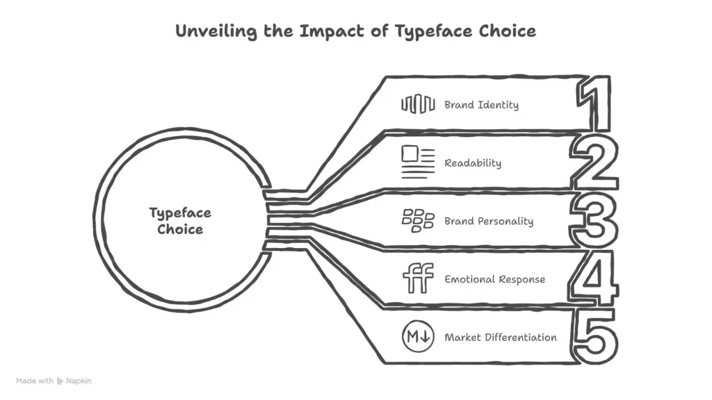
Struggling to pick fonts that reflect your startup’s personality? You’re not alone. In the tech, fintech, healthcare, and edtech worlds, typography isn’t just decoration—it’s a silent ambassador for your brand. The right font can build trust, spark innovation, or foster calm—all while boosting conversions.
Now, let’s dive into the specifics for each industry, starting with tech startups—where agility and creativity reign supreme.
Why Fonts Matter for Startups
Before diving in, let’s clarify:
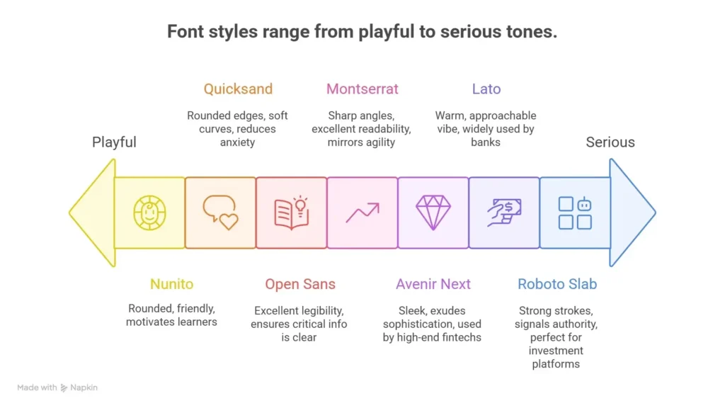
- Tech Startups: Need fonts that scream “innovation” and “scalability.” Think clean lines, geometric shapes, and adaptability.
- Fintech: Prioritize “trust,” “security,” and “precision.” Serifs or structured sans-serifs signal stability.
- Healthcare: Focus on “compassion,” “clarity,” and “reliability.” Soft serifs or rounded sans-serifs build empathy.
- Edtech: Balance “approachability” with “modernity.” Playful sans-serifs or friendly scripts keep learners engaged.
1. Best Fonts for Tech Startups
Tech startups thrive on disruption. Your font should mirror agility, creativity, and forward-thinking.
Top Picks:
- Montserrat (Free): A versatile sans-serif with sharp angles and excellent readability. Perfect for apps, websites, and branding.
- Inter (Free): Designed for screens, Inter offers optimal legibility even at small sizes. Ideal for SaaS products.
- Poppins (Free/Premium): Bold and geometric, Poppins adds energy without sacrificing professionalism. Great for landing pages.
Pairing Example:
Headline: Montserrat Bold (e.g., “Revolutionize Your Workflow”)
Body: Inter Regular (e.g., product descriptions)
👉 Download This Pairing →
Why It Works:
Montserrat’s angularity conveys innovation, while Inter’s neutrality ensures clarity. Together, they balance creativity and functionality—key for tech brands.
Shifting Gears to Fintech: Where Trust Takes Center Stage
While tech prioritizes cutting-edge design, fintech requires a different kind of trust—precision and reliability. Let’s explore fonts that signal safety and competence.
2. Best Fonts for Fintech Companies
Fintech demands confidence. Your font must communicate security, precision, and trust—critical for handling money.
Top Picks:
- Lato (Free): A classic sans-serif with a warm, approachable vibe. Widely used by banks (e.g., DBS Bank).
- Roboto Slab (Free): A robust serif with strong strokes. Signals authority and reliability—perfect for investment platforms.
- Avenir Next (Premium): Sleek and modern, Avenir Next exudes sophistication. Used by high-end fintechs like Revolut.
Pairing Example:
Headline: Roboto Slab Bold (e.g., “Secure Your Future”)
Body: Lato Regular (e.g., transaction details)
👉 Download This Pairing →
Why It Works:
Roboto Slab’s weight builds trust, while Lato’s simplicity prevents overwhelm. This duo reassures users their finances are in safe hands.
Meanwhile, Healthcare Demands Empathy Alongside Clarity
Fintech focuses on numbers, but healthcare centers on people. Here, fonts must bridge compassion and professionalism—let’s see how.
3. Best Fonts for Healthcare Brands
Healthcare hinges on empathy and clarity. Your font should feel caring, professional, and easy to read—especially for patient-facing materials.
Top Picks:
- Open Sans (Free): A neutral sans-serif with excellent legibility. Loved by hospitals (e.g., Mayo Clinic).
- Quicksand (Free): Rounded edges and soft curves create a friendly, approachable feel. Great for telehealth apps.
- Merriweather (Free): A classic serif with gentle spacing. Evokes tradition and care—ideal for clinics.
Pairing Example:
Headline: Quicksand Bold (e.g., “Your Health, Our Priority”)
Body: Open Sans Regular (e.g., appointment reminders)
👉 Download This Pairing →
Why It Works:
Quicksand’s warmth reduces anxiety, while Open Sans ensures critical info (dosages, appointments) is never missed.
Finally, Edtech Thrives on Making Learning Engaging
Healthcare cares for bodies; edtech nurtures minds. Here, fonts must spark curiosity while keeping content digestible—let’s dive in.
4. Best Fonts for Edtech Platforms
Edtech needs fonts that educate and inspire. Aim for approachability without sacrificing modernity—think “fun but focused.”
Top Picks:
- Nunito (Free): Rounded and playful, Nunito feels like a friend. Popular with learning apps (e.g., Duolingo).
- Rubik (Free): Geometric and balanced, Rubik works for both kids and adults. Used by edtech giants like Khan Academy.
- Comfortaa (Free): Handwritten-style sans-serif. Adds personality to quizzes and interactive content.
Pairing Example:
Headline: Nunito Bold (e.g., “Learn Without Limits”)
Body: Rubik Regular (e.g., course modules)
👉 Download This Pairing →
Why It Works:
Nunito’s playfulness motivates learners, while Rubik’s structure keeps content organized. Together, they make education feel accessible.
Pro Tips for Font Selection
Beyond industry-specific choices, here are universal strategies to elevate your typography:
- Limit to 2-3 Fonts: Too many styles confuse users. Stick to one headline, one body, and one accent font.
- Prioritize Readability: Test fonts on mobile—small screens demand clarity.
- Match Brand Values: A fintech using a whimsical script? Risky. Align style with your mission.
- Use Free Tools: Google Fonts (free) and Adobe Fonts (premium) offer vast libraries.
Pricing Breakdown
| Font Type | Free Options | Premium Options |
|---|---|---|
| Tech | Montserrat, Inter | Avenir Next (~₹500/year) |
| Fintech | Lato, Roboto Slab | Helvetica Neue (~₹800/year) |
| Healthcare | Open Sans, Quicksand | Gotham (~₹600/year) |
| Edtech | Nunito, Rubik | Brandon Grotesque (~₹700/year) |
Note: Prices vary based on licensing (webfont, desktop, etc.). Always check the provider’s website.
Final Checklist Before Launching
- Does your font match your brand’s personality?
- Is it readable on all devices?
- Have you tested contrast (dark text on light backgrounds)?
- Did you download our pairings? 👉 Get Them Here
Fonts aren’t just letters—they’re the voice of your brand. Choose wisely, and watch your startup’s credibility soar!
Want to design your 1st Start-up
FAQs
Yes—with caveats! Platforms like Google Fonts (e.g., Montserrat, Inter) offer open-source licenses for commercial projects. Avoid “free” fonts from unverified sources (they may contain malware or hidden fees). Stick to reputable providers like Google Fonts, Adobe Fonts, or paid marketplaces (e.g., Envato Elements).
Prioritize sans-serif fonts (e.g., Inter, Lato) for body text—they have cleaner lines and perform better on small screens. Test your chosen fonts on multiple devices (iOS/Android) using tools like BrowserStack. Avoid overly decorative scripts or thin weights for mobile content.
No—each industry has unique expectations. For example:
Tech: Use bold, geometric fonts (Montserrat) to signal innovation.
Fintech: Opt for structured serifs (Roboto Slab) to build trust.
Healthcare: Choose soft, rounded fonts (Quicksand) to evoke compassion.
Tailor your font to your audience’s emotional needs.
Follow the “contrast + harmony” rule:
Contrast: Pair a bold headline font (e.g., Montserrat Bold) with a neutral body font (e.g., Inter Regular).
Harmony: Ensure both fonts share similar moods (e.g., modern sans-serifs like Poppins and Rubik).
Avoid mixing more than 2–3 fonts total.
It depends:
Free fonts (Google Fonts): No license fees for commercial use.
Premium fonts (e.g., Avenir Next): Expect ₹500–₹1,000/year for web/desktop licenses. Always check the provider’s terms—some require additional fees for print or app usage.
Map fonts to your core message:
Trust (fintech): Use serif fonts (Roboto Slab) or structured sans-serifs (Lato).
Innovation (tech): Choose angular, geometric fonts (Poppins).
Compassion (healthcare): Pick rounded, friendly fonts (Quicksand).
Test your font choices with your target audience via surveys or A/B testing.
Yes! Follow WCAG guidelines:
Use a minimum 16px font size for body text.
Ensure contrast ratios of 4.5:1 (dark text on light backgrounds).
Avoid decorative fonts for critical information (e.g., forms, instructions).
If you serve non-English speakers, choose Unicode-friendly fonts (e.g., Nunito, Open Sans) that support accented characters (é, ü, ñ). Test your font with languages like Hindi, Spanish, or Mandarin to avoid display issues.
Very good article nice work keep it up.